The basis of science, and one of its main claims to epistemic validity, is observation and measurement. We do experiments and follow evidence. We enquire into the workings of the world by means of data.
Unfortunately, data is not always well-behaved. It is tricksy and wayward and noisy, subject to contamination and confounding and being not what it seems. The more complex the processes being studied, the more data is needed and the more sources of error there are. And most life science processes are very complex indeed.
Over the years statisticians have come up with a wide variety of techniques for wrestling useful information out of noisy data, ranging from the straightforward to the eye-wateringly complicated. But the best-known and most widely used, even by non-scientists, is much older and simpler still: the average, usually in the form of the arithmetic mean.
Averaging is easy: add up all your data points and divide by how many there were. Formal notation is frankly superfluous, but I’ve got a MathJax and I’m gonna use it, so for data points $x_1$, $x_2$, …, $x_n$:
$$\bar{x} = \frac{1}{n} \sum^n_{i=1} x_i$$
The intuition behind averaging is as appealingly straightforward as the calculation: we’re amortising the errors over the measurements. Sometimes we’ll have measured too high, sometimes too low, and we hope that it will roughly balance out.
Because it’s easy to understand and easy to use, averaging is used a lot. I mean A LOT. All the time, for everything. Which is often fine, because it’s actually a pretty useful statistic when applied in an appropriate context. But often it’s a horrible mistake, the sort of thing that buttresses false hypotheses and leads to stupid wrong conclusions. Often it is doing literally the opposite of what the user actually wants, which is to reveal what is going on in the data. Averages can all too easily hide that instead.
Obviously this is not really the fault of the poor old mean. It’s the fault of the scientist who isn’t thinking correctly about what their analysis is actually doing. But averaging is so universal, so ubiquitous, that people just take it for granted without much pause for thought.
The fundamental problem with averaging is, vexingly, also the thing that makes it appealing: it reduces a potentially complex set of data into something much simpler. Complex data sets are difficult to understand, so reduction is often desirable. But in the process a lot of information gets thrown away. Whether or not that’s an issue depends very much on what the data is.
In the simple error model described above, the extra data really is just noise — errors in the measurement process that obscure the single true value that we wish to know. This is the ideal use case for the mean, its whole raison d’être. Provided our error distribution is symmetric — which is to say, we’re about equally likely to get errors either way — we will probably end up with a reasonable estimate of the truth by taking the mean of a bunch of measurements. We don’t really care about the stuff we’re throwing away.
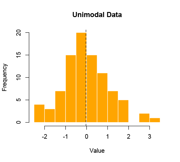
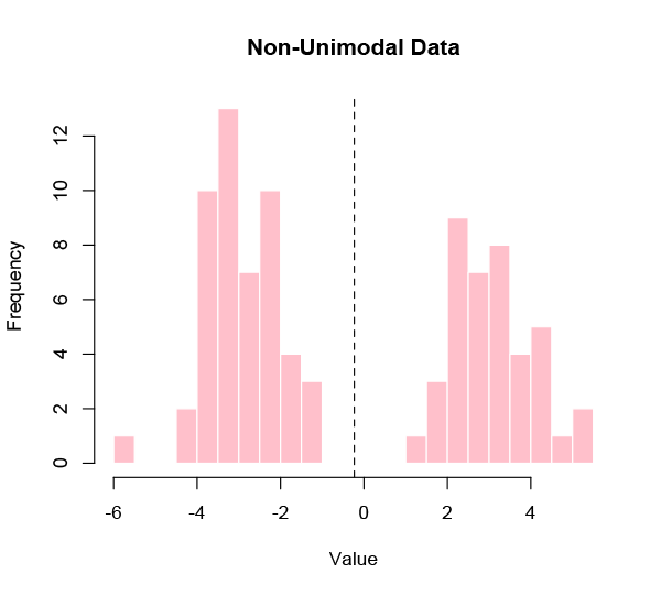
However, this is a very specific kind of problem, and many — perhaps most — sets of data that we might be interested in aren’t like that. It’s actually pretty rare to be looking for a single true value in a data set, because most realistic populations are diverse. If the distribution of the data is not unimodal — meaning clustered around one central value — then the average is going to mislead.
What is the average human height or weight? That seems like a plausible use of the mean, but it’s barely even a meaningful question. A malnourished premature newborn and the world’s tallest adult simply aren’t commensurate. It’s like taking the average of a lightbulb and a school bus. The result tells you nothing useful about either.
This problem is significantly compounded when you start wanting to compare data sets. Which is something we always want to do.
You can, of course, compare two means. One of the most basic and widely used statistical tests — the Student t-test — will do exactly that. But to do so is explicitly to assert that those means do indeed capture what you want to compare. In a diverse population — and again, most realistic populations are diverse — that is a strong assumption, one that needs to be justified with evidence.
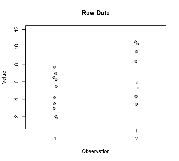
Let’s say you’ve got two sets of observations. The sets are related in some way — they might be from patients before and after a treatment, or children before and after a year of schooling, or shoes worn on left and right feet. The raw data look like this:
You’re looking for a difference — a change, let’s call it an improvement — between these two sets, so you take the means:
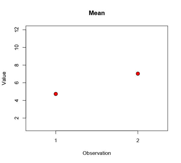
Well, that’s kind of promising: observation 2 definitely looks better. Maybe you draw a line from one to the other to emphasise the change. Obviously there are some differences across the population, so you throw in an error bar to show the spread:
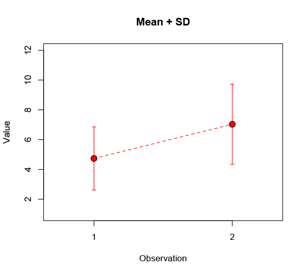
Here I’ve shown the standard deviation, a common and (given some distributional assumptions) useful measure of the variability in a data set. Very often people will instead use a different measure, the standard error of the mean (often shortened to standard error). This is a terrible practice that should be ruthlessly stamped out, but everyone keeps on doing it because it makes their error bars smaller:
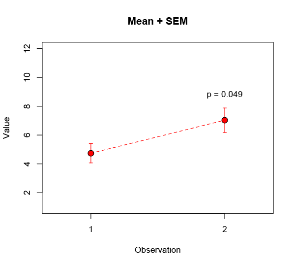
While you’re at it, you might perform the aforementioned t-test on the data and boldly assert there’s a less than 5% probability* the observed improvement could have happened by chance. Huzzah! Write your Nature paper, file your patent, prepare to get rich.
But what we’ve done here is gather a bunch of data — maybe through years of tedious and costly experiments — and then throw most of it away. Some such compression is inevitable when data sets are large, but it needs to be done judiciously. In this case the sets are not actually large — and I’ve concocted them to make a point — so let’s claw back that discarded information and take another look.
In using the means to assess the improvement we implicitly assumed the population changes were homogenous. If instead we look at all the changes individually, a different picture emerges:
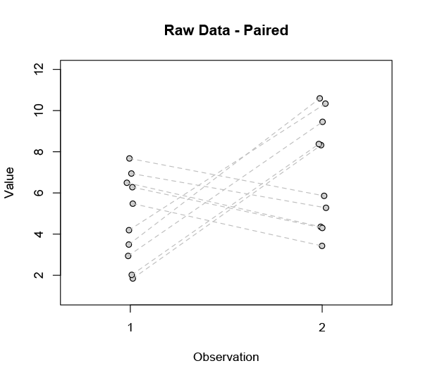
It’s pretty clear that not everyone is responding the same way. Our ostensible improvement is far from universal. In fact there are two radically different subsets in this data:
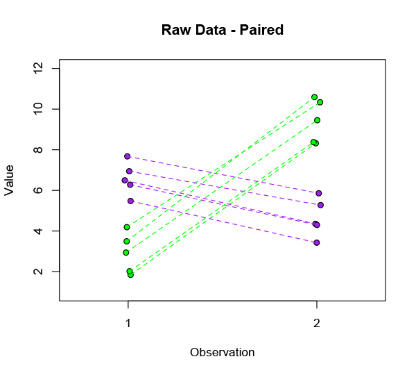
Fully half of the subjects are significantly worse off after treatment — and in fact they were the ones who were doing best to begin with. That’s something we’d really better investigate before marketing our product.
If this were real data, we would want to know what distinguishes the two groups. Is it the mere fact of having a high initial level of whatever it is we’re measuring? Is there some other obvious distinction like sex or smoking? Some specific disease state? Or is there a complex interplay of physiological and social factors that leads to the different outcome? There might be an easy answer, or it might be completely intractable.
Of course, it’s not real data, so the question is meaningless. But the general shape of the problem is not just an idle fiction. It’s endemic. This is rudimentary data analysis stuff, tip of the iceberg, Stats 101 — and people get it wrong all the sodding time. They’re looking at populations they know are drastically heterogenous, but they can scrape a significant p-value by comparing means and that’s all that matters.
Stop it. Don’t be that person. Don’t toss your data away. Recognise its structure. Plot it all. Don’t hide its skew. Don’t make unwarranted assumptions. And don’t take an average unless you actually fucking mean it.
* I’ll save the rant about significance tests for another time.