Photoreceptor neurons, whether rods or cones, either release glutamate or they don’t, there’s no middle ground. They are not equally responsive to light of different wavelengths, but the wavelength isn’t captured by the output, it’s just a yes/no kind of deal. Collectively, the pattern of releases from such a neuron tells you whether it is being stimulated more or less strongly, but it doesn’t tell you if the stimulation is strong because it’s at a wavelength the neuron is more sensitive to or just because there’s a lot of light — the releases would look the same either way. To be able to separate those cases, we would need more information. Fortunately, at least for most of us, more information is available.
The spectral responses of the different kinds of photoreceptors are illustrated below. (Note that each curve’s vertical extent is normalised so the peak sensitivity is at 100% in each case — rods are still way more sensitive that cones, but we don’t need to care about that right now.)
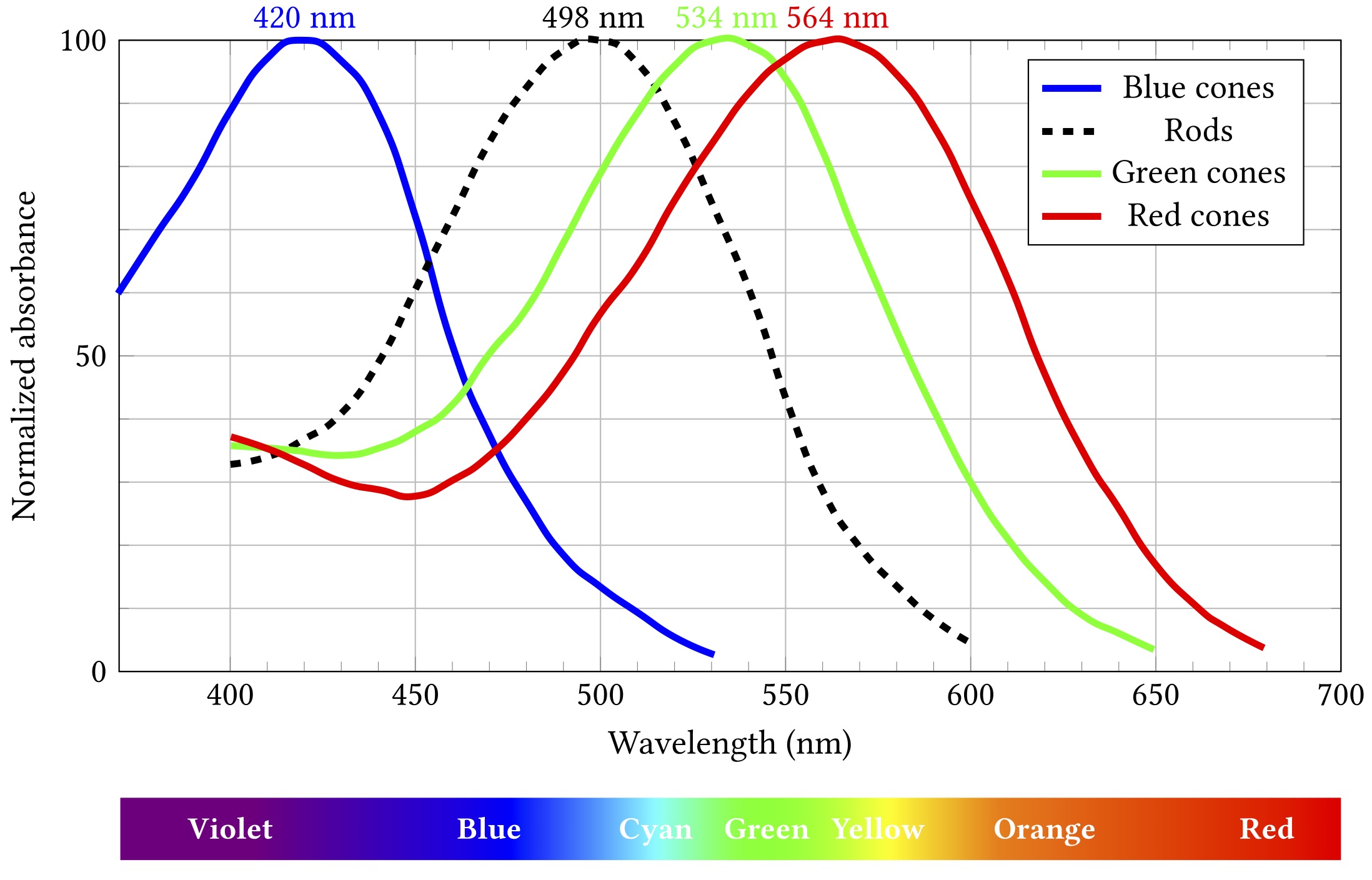
Importantly, while all rods have the same sensitivity, cones come in three different flavours with different absorption spectra. These flavours are sometimes termed blue, green and red, as in the diagram, but are also more accurately, if less picturesquely, known as short, medium and long. If cones of all three types are illuminated by light of the same colour, they will exhibit differing responses — and the differences can be used spectroscopically to determine what colour the light was.
At least, kinda.
Let’s say some blueish light of about 480 nm comes along:
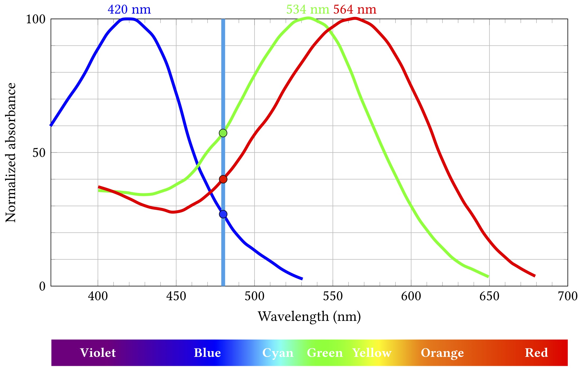
The short wavelength “blue” cones are actually stimulated least by this light, the long “red” cones a bit more, and the medium “green” ones most of all. Importantly, this particular combination of relative stimulation levels does not occur for any other wavelength, and so we can infer that the incoming light is that blueish 480 nm.
Except.
I mean come on, you’re reading this on an RGB screen, how much surprise can I honestly expect to milk out of it?
That uniqueness of inference only works if we know the light is all the same wavelength. That is almost never true, but it’s not a horribly misleading assumption when what you’re seeing started off as broad spectrum white light from the sun and then bounced off a bunch of objects that absorbed a lot of those wavelengths and just left some narrow band to hit your eyes. Which would mostly have been the case most of the time for most of the history of life on Earth. So it’s a pretty decent model for evolution to have hardwired into our biology.
Obviously these days we spend rather a lot of time looking at light from artificial sources for which the model doesn’t hold at all. But — and this is really pretty fortunate for a big chunk of modern human culture and technology — our visual system is still stuck on the veldt, looking for lions or whatever. We can bamboozle it with cheap parlour tricks — and we have gotten really good at those tricks.
You all know how this works: take three different light sources that mostly stimulate the long, medium and short cones respectively. Call ’em, oh I don’t know, red, green and blue? Shine them in the right proportions on your eyes and behold: suddenly you’re seeing orange or turquoise or mauve. Those wavelengths aren’t actually there — does mauve even have a wavelength? — but that doesn’t make your perception of them any less real.
We call these ingredients primary colours, but in what sense are they primary? There’s nothing special about red, green and blue from the point of view of light. Wavelengths don’t mix to make other wavelengths. Violet light is violet, it’s not some mixture of blue and red. Except: what is violetness anyway? As noted back in part 2, colour isn’t a property of light, it’s a perceptual property. I can confidently assert that 425 nm light isn’t a mixture of red and blue, but violet is whatever I see it is.
So primary colours really are primary, in the sense that we can use them to stimulate the perception of (very roughly speaking) any other colour, including some that don’t really exist in the visible spectrum at all. Their primariness — like colour itself — is a product of our physiology and neural processing.
Sing out, Louise. You’ve heard this song before, you probably know the words by now.
And you also know this one: the mechanics of visual perception are complex and fragile and things can go awry.
Colour perception is not universal and you cannot rely on everyone perceiving colours the same way you do — whatever way that is. Various mutations affect the cone cells, leading to a variety of colour vision deficiencies — from somewhat attenuated ability to distinguish between some colours to (rarely) complete monochromacy. These mutations are often sex-linked — ie, the affected proteins are on the X chromosome — so they run in families and mostly affect males.
This can be a problem because colour is a really handy and widely used design feature and popular carrier of meaning. Red means stop, green means go, yellow means go really fast. If you’re constructing an interface or visualising data, you’re probably going to want to put colour to work. Just consider the graphs above — colour is the key distinguishing feature of the three cone lines. So it’s a teensy bit problematic that up to 8% of the men reading this (pretend for a moment than anyone is going to read this) might struggle to tell two of them apart.
(Okay, yes, I’m wrapping this chapter with a rhetorical flourish and it’s really a lie — those particular lines are distinguishable by luminance as well as colour, so 8% of men will probably muddle through — but the point stands more broadly, just go with it.)